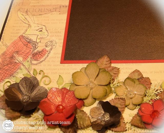
Hello everyone and welcome to Club Scraps October blog hop featuring the NEW Literature Kit! If you arrived from Deb's Blog then you are in the right place , if not you will want to start from the beginning at Karen(Club Scrap blog)so you don't miss any of the wonderful inspiration from the Club Scrap Artist Team! There is also a list of the entire line up there for you with links :) Have fun & I hope you enjoy todays Hop!My project today is a Literature Layout using all the beautiful design papers/Card Stock, Ribbon, and the tag from the sheet of cut aparts. My layout was super simple to make! I will list how to below! All items are from the Literature kit except my OLD beads, and the flower on the bow.
Instructions:
1 - 12 x 12 cream sheet of card stock
1 - 12 x 12 sheet of shimmer brown card stock cut to 11 3/4" x 11 3/4"
1 - 12 x 12 design paper sheet cut to 11 1/2" x 11 1/2"
Sew the top 2 layers together, then used ATG gun to attach to the cream layer, so you wont see sewing in the back.
Next I figured out my layout, by adding the 2 photo matt layers to the center of my page. I did NOT glue this down, as I just set it there for a reference on where to place my flowers.
Now cutting flowers. I did use cheery Lynns Judy's Blooms. I cut the red card stock, brown shimmer card stock, and the kraft card stock all in flowers for my page. Next I used the flourish #8 for my flourishes. Everything is distressed using tim holtz distress inks in forest moss(flowers) and for the flourishes. The centers have old beads glut on. I also spritzed my page after it was done with a gold glimmer mist.
Sentiment frame- was cut from one of the cut apart sheets and then distressed using vintage photo. above the tag I added a bow created with the Red Ribbon from the Literature Kit. I did add a fancy flower to the center.
Now we are ready to figure out where to place all the flowers. I normally will lay them out how I think I like them, and then move them around a bit. I also decided to add 3 above the matt for the photo as I felt it balanced the page out some.
I also cut out my flourishes and added them first by gluing them down. Then added my flowers, and lastly came in with filler leaves/and branches. I glued everything down and let dry. Lastly came in with the Gold Glimmer Mist, and spritzed my flowers and some areas on the page. Dabbed it dry with a towel.
I really enjoyed creating my layout for todays hop!! :) Your next stop on the HOP is Josette's Blog! Have fun!!!
Thank you for stopping by and joining us today!
Hugs to all,
Cheryl


17 comments:
Such a beautiful page, with lots of lovely flower embellisments.
Well done, Cheryl.
Oh the flowers!!! Love them on this page!!! Pretty!
Stunning work Cheryl. Love all the flowers!!!
What everyone above has said and more. This is just lovely.
Oh, Cheryl, if is isn't your bows, it's your flowers. On payday, I'm going to purchase a flower punch because these are just too beautiful to be missed. Great job!
Cheryl, this is gorgeous! I love the placement of the flowers, so pretty!
The fun print and your gorgeous addition of punches flowers make such a beautiful combination!
Simply gorgeous!
I love all the little details...definitely a frame-worthy layout!
Beautiful LO,the flowers are a great addition!!
Wow, a really beautiful combination for sure. Such a lovely job on this!!
I love flowers and this page is stunning with the flower detail. Beautiful page!
Your layout is elegant! Love it!
How beautiful! I love the gold mist when all is said and done. Gives it the last touch of class.
Beautiful layout -the flowers are just the perfect accent to the LO!!
Very beautiful, love all the flowers
So much detail and dimension on your pages. Beautiful work.
Post a Comment